Hans Buskes and Philippe Packu in their recent book on mind mapping raise the issue of the best fonts to use in mind maps for clarity and usefulness.
I tend to agree with their suggestions BUT ONLY when the mind map is developed for general communication to large groups of people with whom the mind map developer probably has little direct connection. This is the typical situation for mind maps shown in books written by “mind mapping experts” for general groups of readers. It is the typical situation in management consulting and professional presentations.
BUT …
- my notes are for me; your notes are for you
- my to do list is for me; your to do list is for you
- my personal feelings are for me
- my life history is for me and my family
- my social history is for me and my friends
- my creative work is best done with small groups of peers, friends, and colleagues who communicate with one another in a relaxed and informal way
Makes you wonder whether developing mind maps with “standard business” fonts such as Georgia or Tahoma or Arial or Times Roman is an especially effective way to make maps primarily for your own use, especially if you have any types of cognitive impairment or special cognitive needs.
I am much more motivated to work on maps and refer to them and plan from them and keep my schedule in a mind map if the fonts in the mind maps do not look like I have urgent BUSINESS PRESENTATIONS to make.
I like to kick back and use a large number of different professionally developed “hand-printed” fonts which I often match to the topics/content of the map and whatever gets the creative juices going.
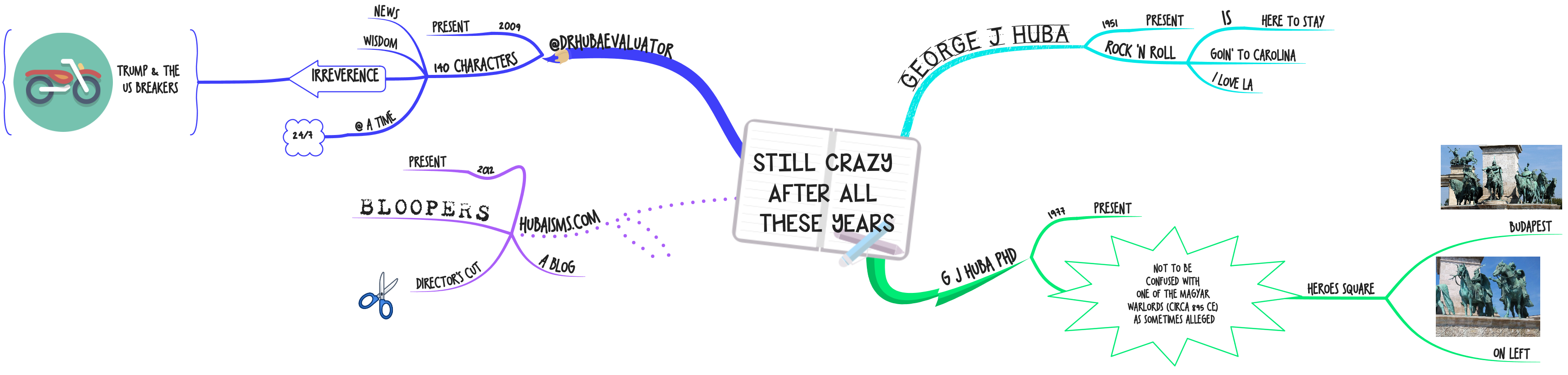
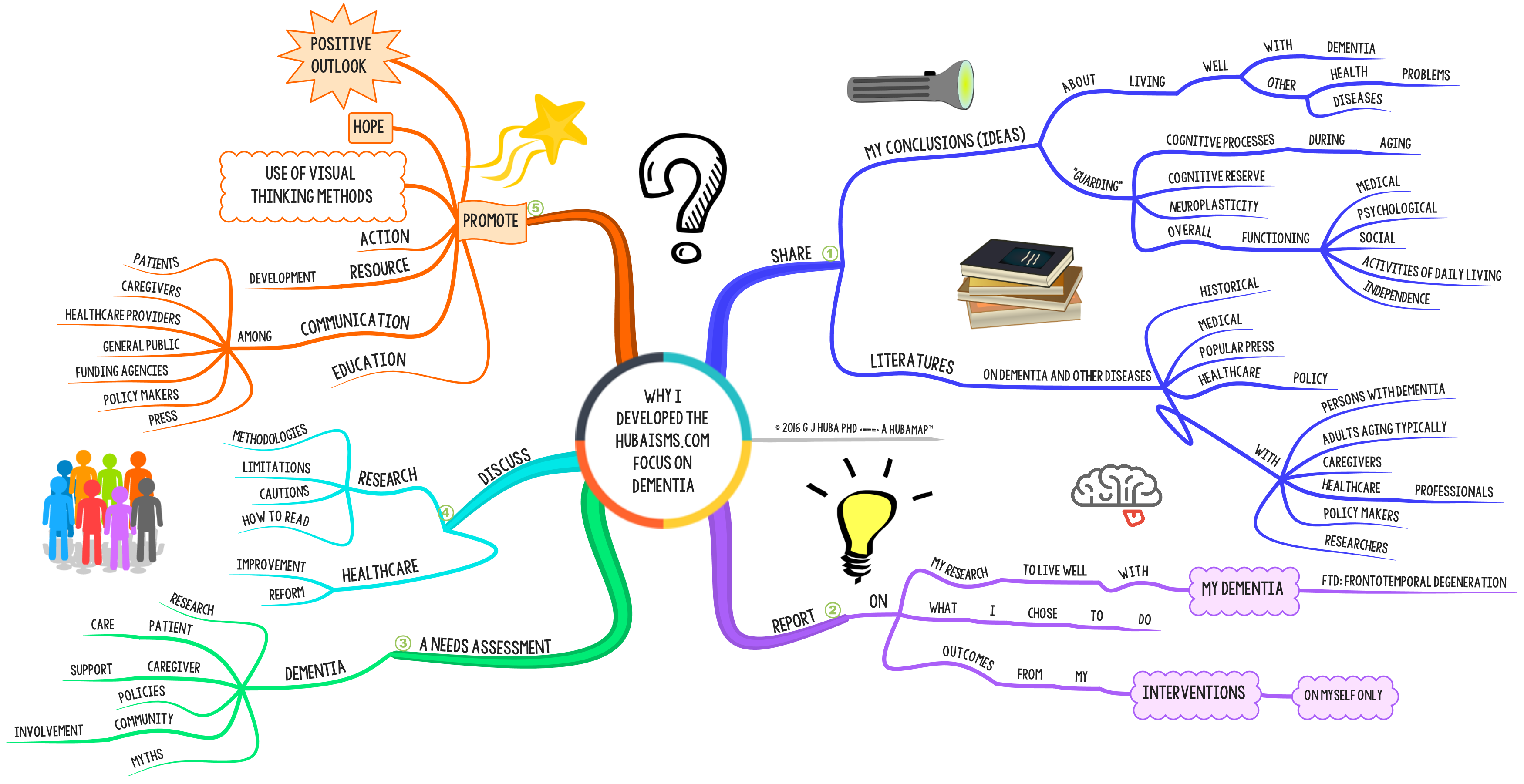
You can see lots of examples of using fonts to inspire creativity in the variations among the mind maps presented in the posts in this blog.
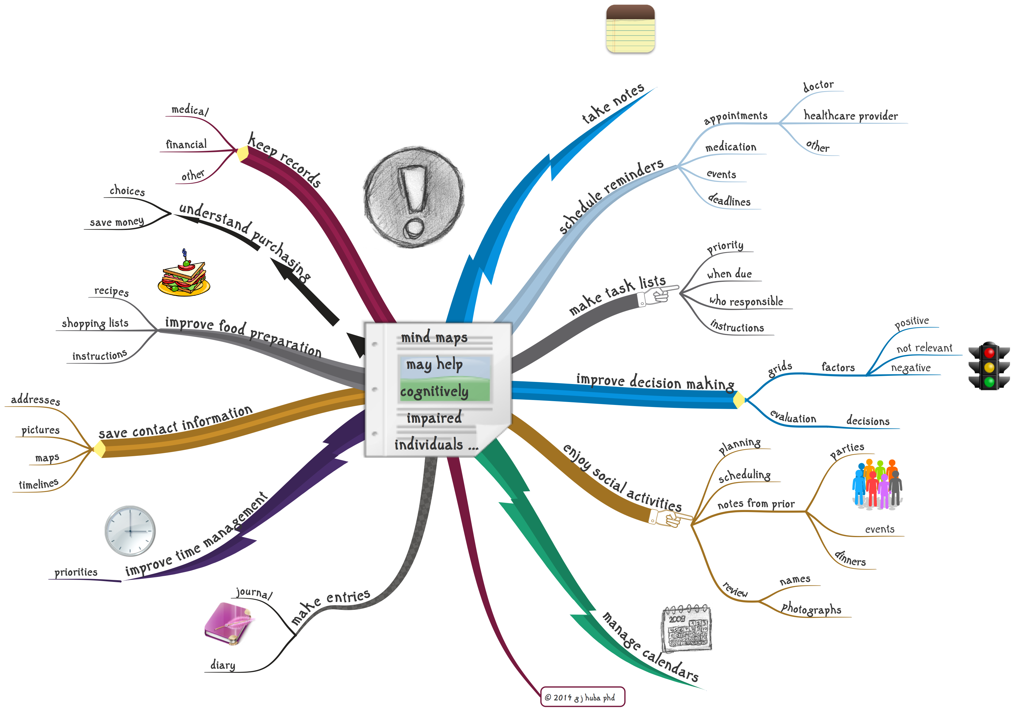
Now, let’s generalize these concerns to people with various kinds of cognitive and perceptual impairments (mild cognitive impairment or MCI, early-stage dementia, later stages of dementia, typical aging, learning disabilities, and illness).
Someone with mild cognitive impairment developing a mind map to help in planning an event or making a decision or scheduling may find it much easier, productive, and creative to work with mind maps in various unique fonts appropriate for the topic, the individual’s preferences, or for novelty rather the usual “readable” business fonts. Many no longer work or ever had the opportunity to work among those who develop “management” presentations. “Personal” fonts in mind maps and other visual thinking methods may make them more effective as planning, thinking, and memory tools, especially for those with cognitive impairment.
Of course this is my conjecture based on my own preferences and knowledge of some of the relevant literature on neurodegenerative diseases. To the best of my knowledge no studies have ever proven what the best fonts are for mind maps for different types of people with different types of uses for maps on different days of the week in the winter or summer or even when the moon is full.
To push my creativity, I want my maps to look hand-printed and personal and not like a business presentation or a doctoral dissertation.
Now at the extreme you could always use one of the free services on the Internet for developing your own personal font(s) based on your own printing or cursive writing! I tried. The results are below.
I personally intend to stay with commercially developed hand-printed fonts by pros and try to pass those off as “my own” handwriting. I am sure that I can read their “handwriting” a lot better than my own.
🙂
Click on image to expand.

Like this:
Like Loading...


