Info

social, health, political imagery through the lens of G J Huba PhD © 2012-2021

Archive for

For two years I have argued that mind maps can be (are) good ways to summarize complicated research into easily-understood theoretical models. The mind map below has gone through a few iterations since 2010. This is my version of November 25 2012. All pictures are of the same map.


In November 2011, I first distributed a framework for getting rid of HIV/AIDS once and for all. Yes, it will be expensive. Yes, it will take international cooperation. Yes countries, agencies, and individuals have to stop behaving like spoiled children. Yes, it can be done. My ideas are shown below in a slight update made in July 2012.

I like zoos. A lot. It probably results from living on the top floor in an apartment building facing the Bronx Zoo as a young child. Looking through the apartment window you could see the zoo. The lions are a much better alarm clock than the wind up mechanical ones of the 1950s. My mom took us to the zoo every day for a walk (that was in an era when zoos had free admission). The elephants were my faves and I would always show them my new toys and clothes. An ice cream on a stick was part of the journey. And yes, I have seen a duckbill platypus hundreds of times.

I know it is not politically correct to like zoos. Oh well, there are times when I am not politically correct.

I like to go to zoos on Thanksgiving morning. It seems like there are about 50 people in the zoo (you can sometimes walk for many minutes without seeing another visitor). You can get right up to the windows to view the animals. You can take pictures you would never get in the usual crowds.

Zoos are the anti-“cable tv news channels.” On Thanksgiving if you go to the zoo you can ignore the other kind of Fox. That species is even less politically correct than I am.


The elegance of math is something that has always fascinated me.

In ninth grade I won the state mathematics championship with a project that looked at some of the implications of nonlinear measurement. Almost 50 years ago. I doubt I could understand the modern version of this ninth grade knowledge from the 1960s.

In 1969 I discovered the lava lamp in the East Village of Manhattan. Back then the East Village was one of the most run-down parts of New York, as was Harlem. I wish I had purchased townhouses in both the East Village and Harlem back then. Former heroin shooting galleries are now multi-million dollar townhouses and four star restaurants. (more…)

In the current healthcare system, the people who most need help are the least likely to get it.

Think they need an annual physical, some vaccinations, antibiotics when they get an infection, a scolding when they get too fat, and a lecture when they smoke?  Think again.

How do you deal with an individual who comes into an emergency room (or in the era of Obamacare, the office of a primary health provider) and is “sick.” Is it because they are homeless or abusing drugs or never had regular healthcare before or struggle with a psychiatric diagnosis perhaps developed as a survivor of rape, incest, or alcoholic parents?

Who do you think is in the current publicly-supported healthcare system of last resort? If that panhandler at the stop sign comes to see a doctor, the patient will typically be hungry, a chain smoker, unable to tell a coherent story or provide a medical history, and prepared to blame a doctor for not being able to fix all of the problems the person has encountered through life. Can you separate a life of living on the street while using drugs and eating fast food with lots of fat and cholesterol from what is found in a simple annual blood panel? Can you tell the medical patient to start eating in a healthy way (when the patient is homeless, has no job, has no money for Whole Foods Market)? Can you expect these patients to adhere to a doctor recommended treatment-intervention which might include lots of pills for an unhealthy lifestyle or because of HIV/AIDS?

High need patient-clients in the healthcare system have many needs and difficulties. Fix one and you see three more problems.

We need a system that can deal with patients-clients that have many of the problems shown in the mind map below. Concurrently. Simultaneously.

or alternately (same model, different way of viewing it) …

PS. I know that effective and cost-effective healthcare/socialcare agencies can be built because the US government has created dozens, if not hundreds, of these programs as “demonstrations” that the concept works. The program is then funded for about five years at a “fair” level and after five years receives no further federal funding (the program is then supposed to have a rich aunt or a “corporate” fund raising department). We KNOW that comprehensive service systems can be built, be effective, use resources appropriately and frugally.

It just takes a village.

Oprah, where are you?

I am writing this text. Alone. Now.

What do you think? Why?

How should I improve? When? Why? Where?

Aren’t questions interesting? How? Which? Why?

Who? Me. 11.12.12

The big questions of 2012: What, Who, Where, When, Why, How, Which, WTF.

Especially WTF.

Isn’t it interesting how WTF has been the primary question we ask while viewing politics, discrimination, inequity, stoopidity, and lack of human rights? And isn’t it a good thing it has?

Day One is a small Mac-iPad-iPhone for journaling. It is a very simple app that elegantly reminds you to make journal entries at time intervals you select throughout the day. It handles pictures very well (taking pictures with an iPhone/iPad or using images from the camera roll). I have tried dozens of these kinds of apps over the years including just adapting standard word processing programs.

This is the only journaling app that I have ever been able to motivate myself to use on a regular basis.

It strikes me that this could also be a very good program as a lab notebook or data analysis notebook in that major issues can be typed in with automatic timelines, pictures, etc. While it does not have a built in sketching routine, you can always do a rough sketch on a piece of paper and photograph it as part of the entry with an iPhone or iPad camera.

UPDATE: In December, Apple chose Day One as their app of the year for 2012.

UPDATE 2: February 6, 2013. I like this app more than ever. I frequently use the synching between Mac and iDevices and it works very well and seamlessly. It is possible to import old photographs and (if the photo has a standard date entry) the photograph will automatically land on the correct date page of the journal.

One of the things that has frustrated me in the past six months is that as I look back over 60 years, I would like to be able to organize much of the information I accumulated in mind maps into something that looks like a time line. I did learn a while ago about the absolutely fantastic time line mind maps developed by Hans Buskes (@hansbuskes on Twitter; http://mastermindmaps.wordpress.com/) and  Philippe Packu (@IPhilVeryGood on Twitter; http://www.drawmeanidea.com/). These guys have some incredible examples. Far beyond my artistic ability.

So I kept using regular mind maps with a first branch being a year or range of years. The example below shows my reactions to the presidencies of the individuals who served as POTUS during my lifetime. But, notice a little trick I introduced. Instead of the year branch coming directly out of the central idea, I have a “blank” or filler branch and then the time period branch comes out of that. No big deal. Just like a regular mind map with a little piece of formatting.

What I discovered is that my adding the extra (padded) branches in the mind maps like those above, it then takes just about 10 minutes (I need more practice) to go from the mind map above to the one below.

All you have to do is turn off the automatic routine for changing the positions of the branches and drag them around a little. You get the the nice straight line by pinning each of the extra padded branches along a straight line and then letting little time-cluster mind maps grow at the various temporal nodes. Takes almost no time. (Ok, so I did stop and do a little font and picture formatting but it is no big deal). All of these good things happen because the program I used (iMindMap) has a feature that permits you to pin some or all of the branches into specific places. In this case you just have to pin the one padded branch for each of the time nodes.

Want a 3D timeline? Hit the button in iMindMap and you can have one like that below. Note that you also can treat the timeline as a “regular” iMindMap in terms of changing fonts, colors, styles, and adding clip art and images. Kind of cool. I was heavily influenced by the work of Hans and Philippe: this is my attempt to simplify it.

Want a timeline presentation? Yup. There’s a button for that too.

One of the very best apps on my Mac is Fantastical. You use it conjunction with the default Apple calendar. Want to make a calendar entry in the future? Just type “Bob next Thursday at 4pm.” Or type “Bob every Thursday at 4pm until 4:20pm.” Or “Bob every 25th day of month at 2pm.” Or Bob “On the Thursday after President’s Day in 2015 from 4pm until 7pm.” Mac, a couple of bucks. If you synch your calendars via iCloud, the appointment will be on your iPhone and iPad before you can open the calendar. Got it? Get it. Saves huge amounts of time and also removes an obstacle to calendaring. I’ve been using it for months and would never take it off my MacBook.

I spent 35 years studying more than a thousand health and social care systems designed to serve the most underserved, disenfranchised, and poor members of our society. These programs were located in 38 states and most major cities of the United States. I think we know what makes a service system successful. Here are my conclusions. And most of these changes are not necessarily expensive to make.

I spent years and years of my professional life being trained in, developing, and applying deductive reasoning. I was taught that the random assignment experiment is the gold standard for science. I’ve seen an entire important field in psychology (social psychology) trivialized and made irrelevant by forcing random assignments and rigid instrumentation into trying to explain synergistic and nonlinear social behaviors (after all what is psychology if not a field of the interactions among people as they progress in a nonlinear way, sometimes forward, sometimes back). The complexity of human cognition has been studied in a superficially simple way by random experiments (primarily with samples of college students).

I do, of course, realize that my position is neither the majority one, nor very popular at all among most academic psychologists, although a few will agree with me (especially those who study diagnostic categories and how programs work in situations where random assignment to service is idiotic and not possible anyway as staff will not withhold what they believe is the most effective interventions from clients).

Who is right and who is wrong? I dunno. We do know which camp writes the most in their beloved peer-reviewed (by their like-minded colleagues) journals.

Recently I have been thinking about which type of mind map might be most appropriate for the different types of scientific method. I have been influenced heavily in my thinking by Roy Grubb, an IT consultant in Hong Kong with an encyclopedic knowledge of methods of visualizing and using information with hundreds of programs that he has studied over 30 years; Hans Buskes, a management consultant  in the Netherlands who has extensive experience in mapping innovative ideas with what a I would term a “semi-organic” approach, and Chris Griffiths in the United Kingdom, whose company ThinkBuzan produces the program iMindMap incorporating what I would term the neo-Buzan organic mind map style.

I would categorize mind maps along a continuum from very linear to the extend that they can effectively be formatted outlines with text snippets and at the other pole, very organic with the extensive use of twists and turns, color, graphics (most cartoon-like), fonts, and other methods to motivate creative approaches and multi-channel memory encoding. The organic approach can be very nonlinear in content, as well as appearance.

Here is a mind map contrasting deductive with inductive reasoning methods in various fields of science, of which my own reference is to psychology and medicine-healthcare. While the left side of the map is about deductive reasoning and is drawn as such and the right side is about inductive reasoning, the overall style of the map is organic. Note that the inductive side gets the “full organic treatment” with font variations, size variations, and a number of cartoons designed to spark associations and multi-channel memory. The left (deductive) side has organic branches by none of the embellishments that are part of the style. This map was produced in Version 6.1 of the iMindMap program.

Figure 1: “Organic Style”
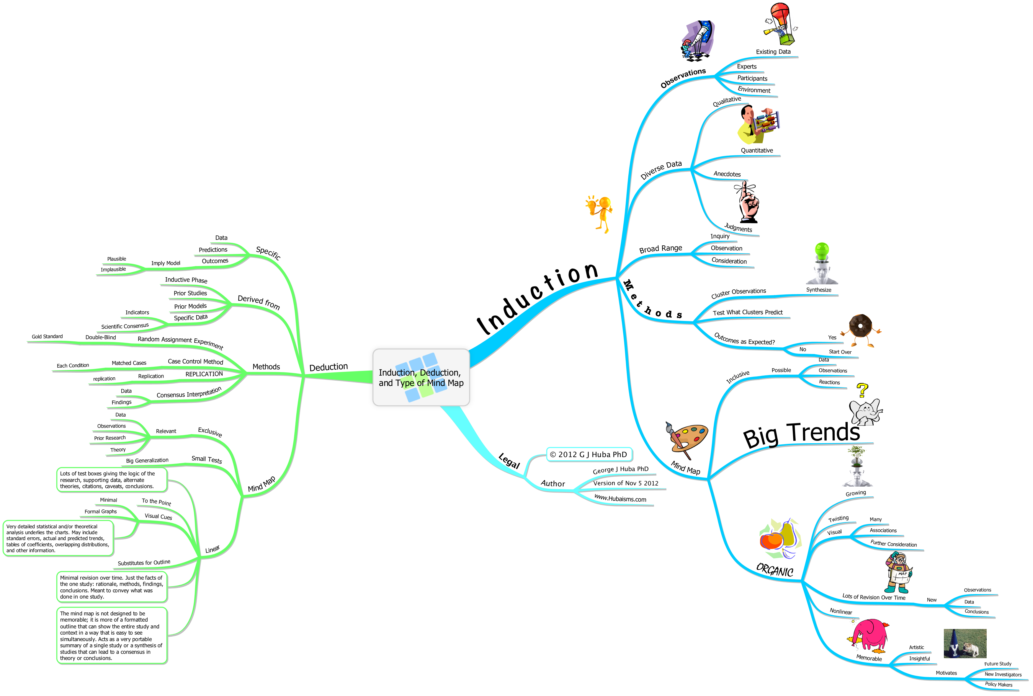
Figure 1a is the same as Figure 1 but printed in 3D style.

The second figure has the same content as Figure 1 but a linear style. I simply converted the model within iMindMap by changing the line style, getting ride of color and font variations, and removing the graphics. I consider this to be a “semi-linear” model; to be fully linear one would also rewrite the text to have longer labels along the branches and many more text boxes for citations, supplementary figures, and other information in a format similar to that of a peer-reviewed science journal.

Figure 2: “Semi-linear Style”

The third version takes the organic map, converts it into a format that can be read by the program XMind, and simply redraws it using the defaults. XMind is derived from some of the earliest open source code and has a very common linear format characteristic of a high percentage of mind map programs including the market leading Mindjet.

Figure 3: Linear Style Using XMind Program Derived from Open Source Code

I came into organic mind mapping a few years ago because I had concluded that maps that look like those of Figure 3 are really just reformatted outlines and the formatting adds little except white space to the presentation. Figures 1a and 1b are more than reformatted outlines; they encourage new associations, multi-channel information encoding, and more attention to the structure.

I’m not very attracted to factory grown/raised  vegetables or chickens either. I think I will start to label my mind maps with this …

The Research by Google Era (rivaling such earlier eras as the Babylonian Empire, the Empire of Alexander, the Roman Empire, the Middle Ages Papacy, the Incan Era, the British Commonwealth,  the American Experiment in Democracy, and the forthcoming Intergalactic Federation) is here.

I think the Research by Google Era is the most “important” one yet.

Go ahead, Google it. How many minorities voted for Obama in 2008? How many times was Bill Clinton sued for “inappropriate” behavior toward female subordinates? How much money did Ghaddafi and family steal from the people of Libya? How many books are contained in the New York Public Library? What is the net worth of Bill and Melinda Gates? Their Foundation? What do they pay the Executive Director of their Foundation? Who should be credited for the “discovery” of the structure of DNA (this one is very complicated; not the DNA model but the politics about who would be credited)? How much did Mitt Romney pay in taxes? Has Mitt ever been audited by the IRS?

Think you know how many Christians, Muslims, and others are in the population of the world? Google it. Now compare the ESTIMATES from the top sources that come out of the search engine. Hhmmm. Kind of hard to tell what percentage of the world’s population is Christian, Muslim, or some other religion isn’t? [I do not hold anyone accountable for knowing the “correct” number of Jews in the world as Jews, to this very minute, are still trying to figure out who is a Jew and who gets a free pass to Israeli citizenship. Nobody has any idea how to count Russians forced to abandon Judaism during the era of the Soviet Union or Jewish dads who married a woman who is not Jewish. It goes on and on. Somehow, I suspect that if I knew as much about Islam and “Chinese traditional religion” (under the Chinese communists) as I do about Judaism and its politics, I’d be just as sure there is little consensus on basic number counts.]

Think counting religions is hard? Try getting data on the prevalence and incidence of health issues-problems.

It makes my head spin every night when I see 99% of the  TV reporters struggling to explain the error of a survey. (They use several different erroneous explanations and once in a while somebody gets it correct.) What if we were to also hold them accountable for knowing whether the information they cite is valid, reliable, biased, consistent. Wow. And I haven’t started to spout equations yet. I watch them Google for data while they are on TV and the results are often so ludicrous that they should cut power at the broadcasting tower. Wait until the lawyers figure out that they can sue for incorrect data as the result of a search and win large judgments. Maybe they will even stop suing medical doctors.

Recently a college student was in the news because he plagiarized a post on a blog and copy and pasted it onto his class-assignment blog. Along the way he changed a numbered list to a text list (presumably by pushing one key in Microsoft Word or Pages). Did he plagiarize from a world expert, someone famous, his professor? Nope. He plagiarized from an 11-year-old boy. Presumably Google helped him identify the 11-year-old as the source of the definitive information on poultry farming.

OK boys and girls. Google does not tell you a number or a conclusion or an interpretation or whether a calculation is correct or incorrect. All it tells you is that the publisher of the information on the Internet knows how to get the search engine(s) to go to that site for information on various topics. If all you do is take the data from Google and cut and paste and reformat it the term “research” does not fit. Google itself states that as their lawyers have instructed them to tell you not to trust the data uncovered by Google.

These days, if I were to believe the bio statements in Twitter and Facebook and Linked profiles, I think that it is reasonable to conclude that there are now more people working to trick Google into citing them and their advertising-laden web sites (these are the practitioners of search engine optimization, an arcane field that seems to involve a boiling pot, wand, broom, and common spices available at Walmart) as a definitive source of information than there are people working on creating valid, reliable, and original information and other data.

The Google Era for research. Don’t get too used to it. The empire will soon fall down.

And yes, apparently an 11-year-old can trick Google (and a college student) into thinking he is more of an authority on poultry farming than the US Department of Agriculture or any university agricultural professor or any science writer at a major newspaper. And yes, both the sixth-grader and the college student failed to mention anything about inhumane poultry production practices, genetically engineered turkeys and chickens, and the use of antibiotics in over crowded production areas. Guess Google did not tell them to write that. Or think that such problems are ones worth thinking about. That’s OK if you are in sixth grade, although it is kind of sloppy. College? Lucky for him that pro football does not care about chickens.

iMindMap is in the very highest tier of the mind map programs. There are no mind map programs that surpass it; some argue that a couple of others are in the same tier. Of the high tier programs this is my favorite and the one that best matches the mind maps I like to use for writing, expressing ideas, brainstorming, and now for making presentations.

iMindMap version 6.1 was released as a free upgrade from v6.0 on November 1, 2012. The update is great and any iMindMap user should be installing it now. Everything works a little better and a little faster and the user experience is improved as it always is with one of their upgrades. I like the fact that the developer of this program (ThinkBuzan) keeps releasing free updates every few months between the major versions (4.0, 5.0, 6.0, etc.).. I have found that each of the upgrades over the past two years has been one which introduces new features.

The “killer” feature in v6.1 is the fact that the iMindMap program now makes incredible presentations that can be prepared in the usual two dimensions or three dimensions just by clicking a button. It’s that easy. It works. Presentations look super-duper and the 3-D graphics can be very easily navigated through an on-screen “joy stick” mechanism. But wait, there’s more. The program now permits you to prepare self running kiosk presentations (video files) or to prepare and upload YouTube videos. The kiosk files can also be uploaded to your own web site although it should be noted that the files, even for small maps at lower resolutions, tend to be in excess of one gigabyte. Because of their size, in many cases it will be necessary to store the presentations on YouTube (as private or public files).

iMindMap v6.1 is a giant step forward. Here is one of my maps as a presentation from v6.1. The map is also a statement of how I think this technique needs to be used: content is the Queen.

I think the 3-D options in the new iMindMap are super-duper, although I do recommend you play with the program for an hour because there are little tricks you can find to make the 3-D mind maps (and their presentations) more artistic and more easily understood. The 3-D maps do benefit from a slightly different approach to map design than one would take for a 2-D map. Here are just a few 3-D pictures of the same mind map (with various branches condensed.

Ok, why not 4-D maps incorporating the passage of time?. Of course you can do this although it is not mentioned in the iMindMap materials. The fourth dimension can be added by using the 3-D or kiosk presentation modes AND adding color coding to show how branches get added, deleted, or re-organized over time. It does require the presentation mode to represent time.  I leave it to someone more gifted in geometry than I to figure out the 5-D mind map.

You heard it here first (just kidding): PowerPoint is dead. The linear structure of PowerPoint neither approximates reality very well nor keeps the audience awake. iMindMap presentations better represent the nonlinear structure of most things, events, and people, and can keep the audience on the edge of their seats by having them guess what is coming next. The addition of 4-D in this program is natural and fairly easy.

PowerPoint is dead. There IS a just god. Abe Lincoln was a great orator (see below).

To receive ongoing information about iMindMap, on Twitter follow @GriffithsThinks for theoretical and design issues and @iMindMap for practical issues and retweets of other mind mapping information.

=====

In case you think I was a little late in proclaiming PowerPoint’s demise, you are correct. Abe Lincoln (with a little help from the acclaimed computer scientist Peter Norvig) said it (apologies to Honest Abe).

START HERE ==>> The Gettysburg PowerPoint (Abe Lincoln with Peter Norvig]