Info

social, health, political imagery through the lens of G J Huba PhD © 2012-2021

Posts tagged dyslexia

Last week (June 14, 2017) I received an email from a close friend with a link to an article generated by the North Carolina station of the National Public Radio a month ago. Along with noting that the research process was not what it once was — specifically that I had received a description of a study carried out in India from a psychologist in Israel with a summary of a radio broadcast generated about five miles from my home.

The changes in how we think, process and access information, and communicate change dramatically annually (as well as monthly, weekly, daily even). But is everyone changing how they fit to match our modern world and its information use possibilities?

People of many different income, education, social, and other strata within Indian society took EEGs to study their alpha brain patterns. There were many differences between the way that their brains seemed to work as measured by EEG indicators that could potentially be explained by differences in exposure to different levels and kinds of technologies.

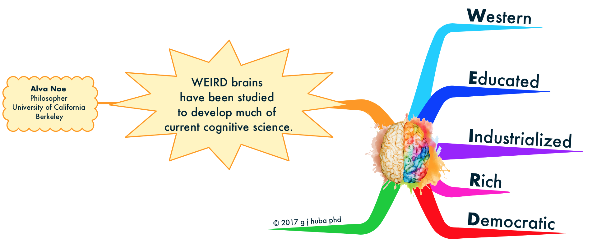
A summary of the work appears here and was written by the University of California, Berkeley, philosopher Alva Noe. Noe discusses how brain wave patterns may have changed as individuals are exposed to the dramatic new information access and processing annually. The original scientific research by Dhanya Parameshwaran and Tara C. Thiagarajan appears here. Noe notes that one of the “problems” in our current conceptions of neurocognitive science is that virtually all of the experimental results have been derived from “WEIRD” brains, that is individuals educated in current technologies within western, industrialized, rich democracies. The Indian results suggest that there are different patterns of “NORMAL” brain waves among individual from other backgrounds.

I find Noe’s ideas to be quite compelling.

Click to open the mind model (aka mind map).

Have a good day.

A phrase you have heard thousands of times (especially if you have lived in California as I did for 30 years). If you have dementia you may groan or the statement may make you angry or you might make a pointed comment back.

Chill, Dudes and Dudettes.

OK, I get it (well actually have gotten it for a number of years since diagnosis). There may not be a 100% good day for you anymore if you have dementia. But how about a perfect (or even good) 20 minutes having coffee with a friend or an hour solving a puzzle with a grandchild or 100 minutes watching Guardians of the Galaxy 2 complete with a refillable tub of popcorn. Yup, these periods of a good day may be followed by a period of frustration or not being able to remember something or difficulty doing a task of daily living.

Use the Force, Luke.

Good moments can be great moments if you let them be. They may last only for few minutes or an afternoon, but given that your brain is “sick” they are a huge gift and blessing. Focus on what is happening to you now, try to not let the bad upset you unduly, and try to enjoy every moment for every second possible.

You may master the Force. You may feel better. Is there a better use of your time?

Focus on what is, not what was.

Click the image of the mind model (mind map) to expand it.

In a prior post, I discussed issues about fonts and their use in mind maps for people with varying types of cognitive impairment. In a second prior post, I showed examples of  using free fonts thought to be useful for individuals with dyslexia.

I spent a lot of time today looking at recommendations about fonts. Generally there seems to be a general consensus that the following fonts may be useful for individuals with dyslexia.

  • OpenDyslexic (one of three variations)*
  • Lexia Readable*
  • Dyslexie**
  • Ventana***
  • Trebuchet***
  • Lucida Grande***
  • Georgia***
  • Comic Sans***
  • Arial***
  • Times Roman***

*free for individuals
**paid
***common and probably on your computer already

Another recommendation is to use a light (beige, pastel) background with a very dark text color (black, navy blue).

Finally, size is an issue with the general recommendation being that it is desirable that the font size be larger than usual.

Would you like to see how different combinations of fonts and color and size work. Click on the image link below and change the fonts, size, and colors and see what happens.

grab64

In a prior post, I discussed issues about fonts and their use in mind maps for people with varying types of cognitive impairment. This post contrasts an original mind map from another recent post to four variations which use different “dyslexia” fonts. Note that the four dyslexia fonts are all available without cost to individuals.

First, the original mind map with an “artistic” professionally drawn font. There is no claim that this font helps or hinders those with dyslexia from reading the map rapidly and accurately.

Click images to expand.

mapvocacy

Here is the same mind map in three variations of the OpenDyslexia font (free).

mapvocacy opendyslexic mapvocacy opendyslexicalta mapvocacy opendyslexicmono

The final example uses the font Lexia Readable, another free font created for those with dyslexia.

mapvocacylexireadable

Of the four “dyslexic” fonts, I prefer the final variant (Lexia Readable). But I do not have dyslexia and so cannot say anything about how well it will work for even one individual (me).

None of the fonts illustrated nor a quite expensive professional one (Dyslexie; not shown here but very similar to the free OpenDyslexia) has strong empirical evidence that it helps those with dyslexia read faster or with more accuracy. Some tiny and flawed studies do suggest efficacy for these fonts for dyslexia, but I do not take the evidence seriously and much more study is needed.

[Note that this post has NOT addressed the issue of whether curved branches should be used or avoided for maps that may be used by dyslexics.]

What do you think?

MAPVOCACY with straight lexia

My personal plan is to provide a second version of some of my mind maps that eliminates curved branches and uses the Lexi Readable font. I do not know if these changes will make the map more readable for those with cognitive impairments (primarily dyslexia), but it certainly does not hurt to put in a little extra effort.